Graphic design is a skill I have been trying to grow on my own for others. First impressions leave lasting impressions, whether a consumer views an ad, graphic or logo first, I want to leave an impact on whatever they view. Below are two logos I created for start up companies over the last year.
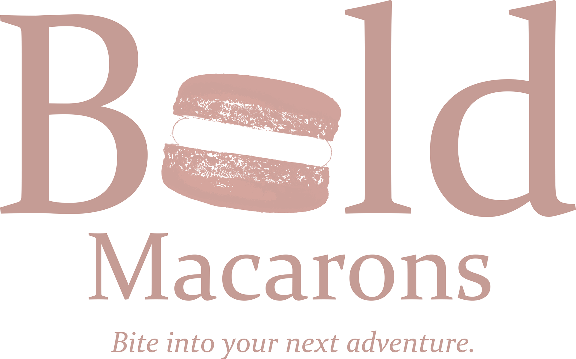
Bold Macarons is a company that solely makes macarons and sells them out of a non-related coffee shop in Providence, RI. The macarons are sold in a box of 3, when a consumer bought a box there was no brand recognition or reference to what these macarons were or where they came from. These macarons were individually crafted by an outside enthusiast, not mass produced with the other backed goods in the back.
I used Adobe Photoshop to create the macaron outline and the rest of the logo. I wanted to keep the company name in the design because as a new company they still need to influence brand recognition and advertise who they are.

Lake Plains Energy LLC. is a start up company located out of Niagara County, NY. They are an energy company that invests in oil wells throughout the United States of America. I wanted to promote their main energy focus with use of a fracking device in the logo so consumers do not assume it is a solar or wind energy company.
I used Adobe Illustrator to form the idea I had in my head and make it a reality. Since the company does not sell tangible products, the "patch" format of the logo appears refined on the pieces the logo appears on.
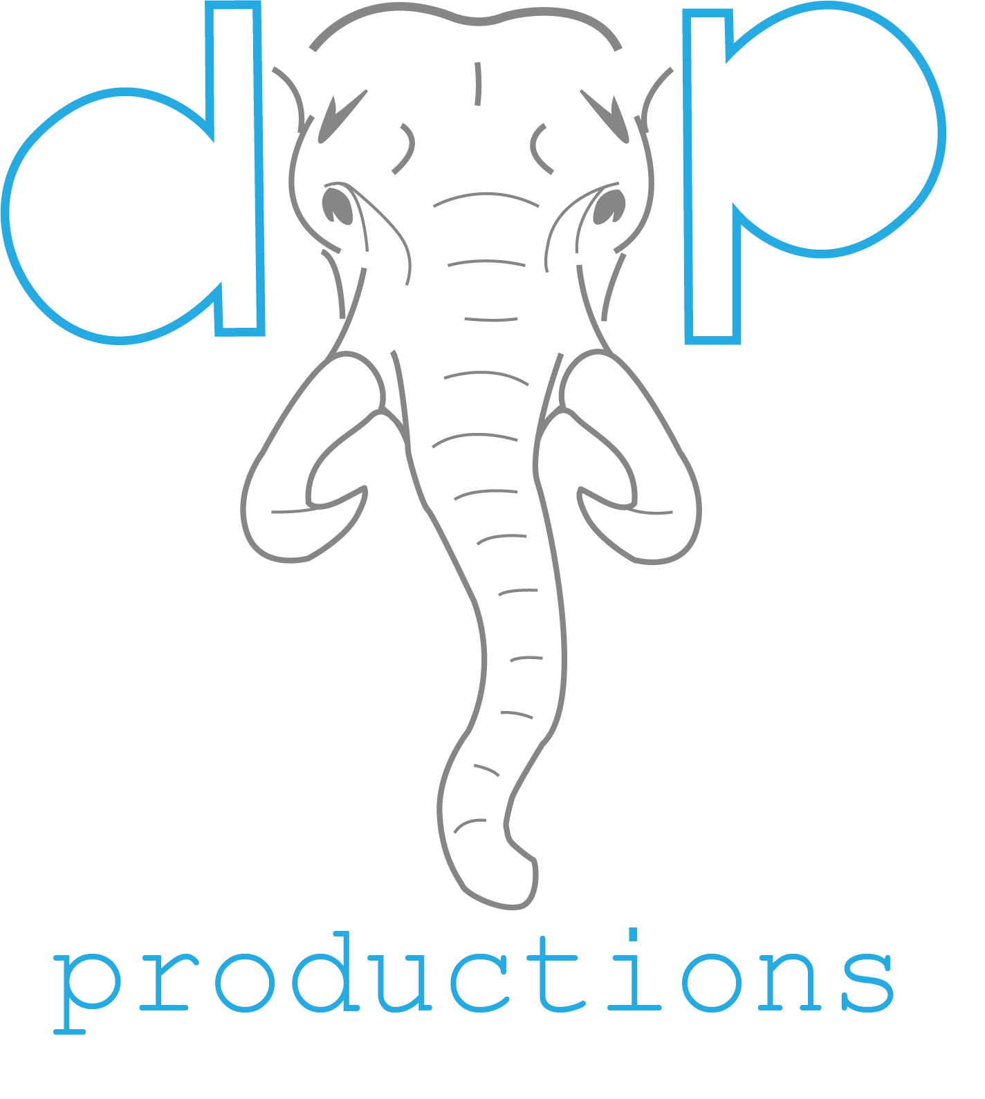
Dumbopalombo Productions is a new Instagram page that I am currently trying to build up. I created a logo for my page so I can filter it in at the beginning or end of my future videos so I can build up brand recognition with my viewers.
My personal Instagram account is @dumbopalombo and I am recognized by that name by many people I meet if they know me by Instagram first. I wanted to incorporate my current Instagram identity with my new one and where I post my work. In doing that, I chose to use an elephant as my logo representing Dumbo the elephant. I also used D and P for the ears for the D and P in DumboPalombo. I used Adobe Illustrator to create the image.
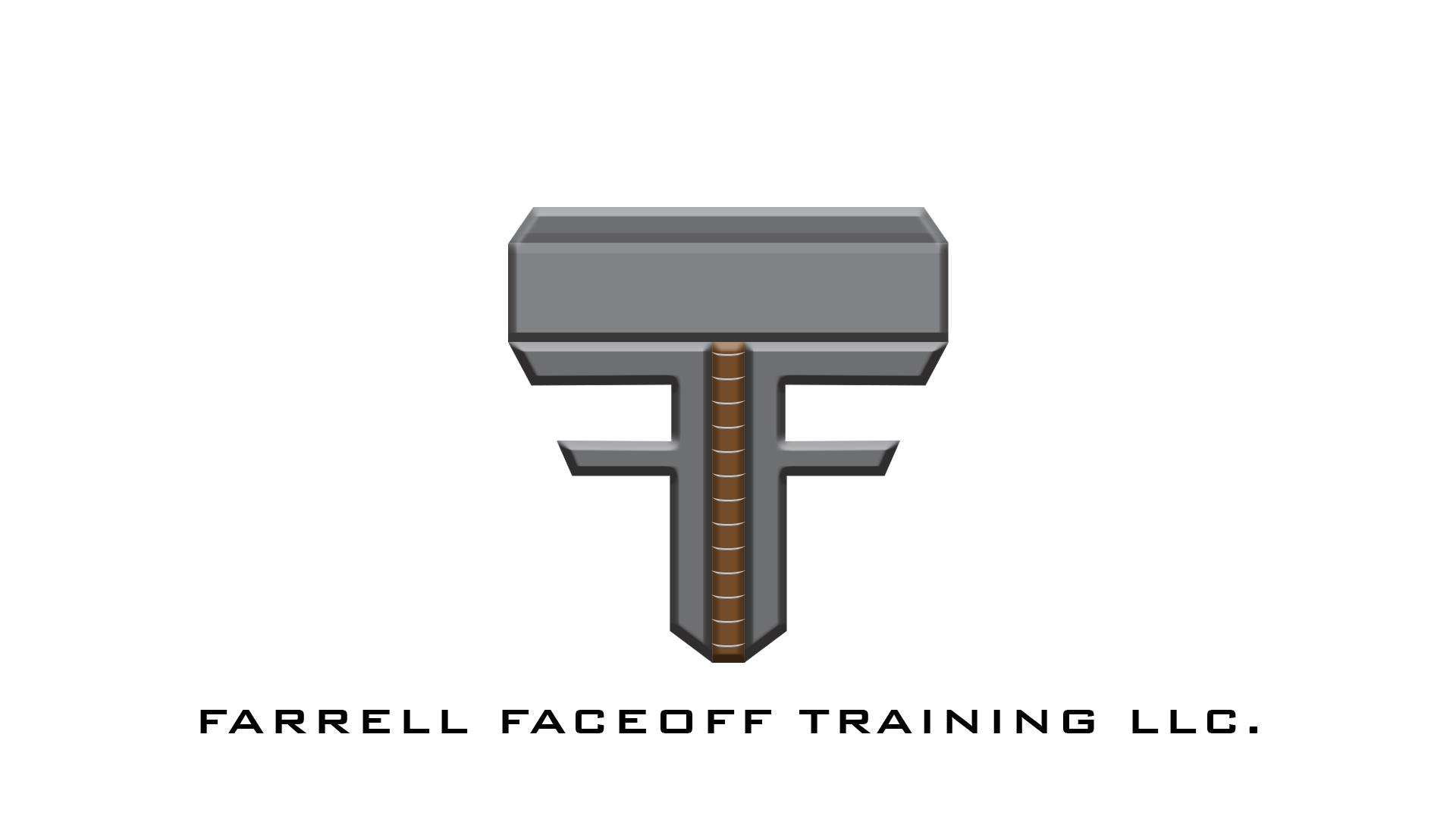
This logo is a mock logo I made for a professional lacrosse player of the PLL, Connor Farrell. Farrell often goes by the name "Thor" because of his long blonde hair. Since that is a huge part of his image I wanted to incorporate Thors hammer. His faceoff company is called Farrell Faceoff Training so I wanted to have the F's in Farrell and Faceoff in the main logo surrounding around the hammer.